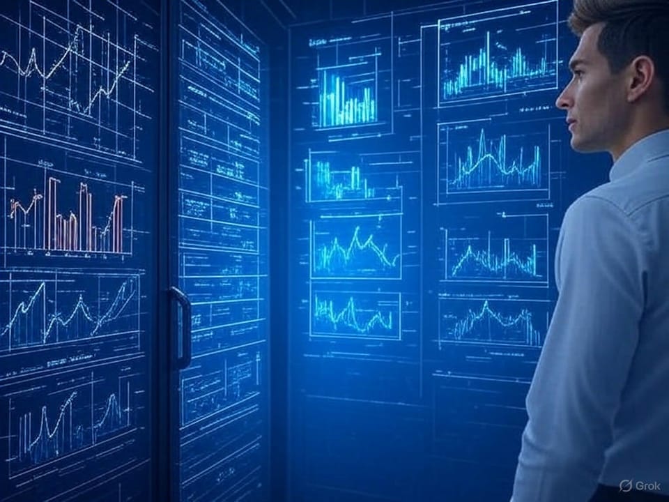
Visualize your integration!
The integration layer is the backbone of modern software ecosystems, enabling seamless communication between disparate systems, applications, and services. However, as integrations grow in complexity, ensuring their reliability and performance becomes a significant challenge. This is where visualizing logs from your integration layer becomes critical. Log visualization transforms raw data into actionable insights, empowering teams to monitor, troubleshoot, and optimize their systems effectively.
Why Visualizing Logs Matters
Logs generated by the integration layer contain a wealth of information—timestamps, error codes, transaction details, and system states. While this data is invaluable, its sheer volume and complexity can make it difficult to interpret in its raw form. Visualization converts this data into graphs, charts, and dashboards, making patterns and anomalies easier to spot. For example, a sudden spike in error rates can be immediately visible on a line graph, alerting teams to potential issues before they escalate.
Benefits of Log Visualization in the Integration Layer
- Proactive Issue Detection
Visualizing logs allows teams to identify issues in real-time. A dashboard displaying API response times can reveal slowdowns in specific endpoints, enabling teams to address bottlenecks before they impact end-users. For instance, a bar chart showing error frequencies across different services can highlight which integrations need attention. - Improved Troubleshooting
When something goes wrong, sifting through thousands of log entries to find the root cause is like searching for a needle in a haystack. Visual tools, such as heatmaps or scatter plots, can pinpoint anomalies—like a cluster of failed transactions at a specific time—making it easier to trace the issue back to its source. - Performance Optimization
Visualizations provide insights into system performance over time. A trend line showing the latency of data transfers between systems can help teams identify patterns, such as increased delays during peak usage hours, and optimize accordingly. This ensures the integration layer runs efficiently, even under heavy load. - Enhanced Collaboration
Visual dashboards are easier to understand than raw logs, making them a powerful tool for cross-functional collaboration. Developers, operations teams, and business stakeholders can all interpret a pie chart showing the distribution of successful versus failed API calls, fostering better communication and faster decision-making. - Compliance and Auditing
Many industries require detailed audit trails for compliance purposes. Visualizing logs ensures that teams can quickly generate reports—such as a timeline of user actions or system events—without manually parsing through data. This is particularly useful for meeting regulatory requirements or conducting post-incident reviews.
Best Practices for Visualizing Integration Layer Logs
- Focus on Key Metrics: Prioritize metrics like error rates, latency, throughput, and transaction volumes. For example, a line graph tracking API response times over a week can reveal performance trends.
- Use Real-Time Dashboards: Tools like Grafana or Kibana can display live data, ensuring teams can react to issues as they happen.
- Leverage Contextual Visuals: Combine logs with metadata—like system health or user activity—to create more meaningful visualizations. A stacked bar chart showing errors by service and user type can provide deeper insights.
- Keep It Simple: Avoid cluttering dashboards with too much data. A clean, focused visualization is more effective than an overloaded one.
Conclusion
Visualizing logs from your integration layer is no longer a luxury—it’s a necessity. By transforming raw log data into intuitive visuals, teams can monitor system health, troubleshoot issues, and optimize performance with greater efficiency. In an era where downtime can cost businesses millions, the ability to quickly interpret and act on integration layer logs is a game-changer. Investing in log visualization tools and practices ensures that your integration layer remains a reliable bridge between your systems, keeping your operations running smoothly.
The how and why is covered our go 2 products here include ELK and Axiom, you can read more on Axiom here: https://twala.tech/axiom/